

"It was collusion from day one!"
Early collaboration is essential to the success of an international campaign.
Comparing language to a virus, William Burroughs once used an analogy that has a harsh relevance for the ‘communicable’ world of advertising. The cohesive qualities of language, however, could also be said to serve as a resistant immune system to shield against foreign ideas and alien market forces. In an effort to “batter down [those] walls”, to borrow from Marx, those forces have to resort not only to “the heavy artillery” of competitive prices but to the ballistics of the advertising industry as well. Without the right delivery, the advertising campaign that lands with sophisticated impact, turning heads and scoring a positive response in one market, may well go down like a lead dirigible in another. Successfully breaching those cultural ramparts requires early collaboration with a transcreation team capable of dismantling a campaign idea and reconstructing it in a form that maintains its core message abroad.
Barriers that once separated the role of transcreator from that of copywriter or translator have become almost as fluid as those that separate the role of today’s journalist from that of polemicist or comedian. At what stage do one set of responsibilities end and another begin? At what point should the transcreation team be introduced to the workflow? As a rule, we look forward to diving into a project at its conceptual stage, usually taking place at the agency charged with its creation and implementation, where we may be taking part in the inaugural brainstorming. Here the agency usually looks to tap into our transcreation/copywriting know-how to assess the campaign’s regional or international feasibility. This is not to suggest that we show up on their doorstep accompanied by a bearded Max Weber clone full of encyclopaedic knowledge of the intricate relationships between economies and cultures worldwide. We are, however, able to draw on our own experience to offer insight into both the strategic goals as well as potential obstacles to an international campaign’s projected implementation. As for the research, our network of hardened ‘Weberians’ can be quickly mobilized should a secondary consulting phase be required. This often takes the form of a culture assessment, with research which may include everything from exploring the potential receptivity to an English adaptation at a target market to an appraisal of the campaign’s design and aesthetic. Does color, for instance, play a critical role and, if so, how will it be variously interpreted? White, traditionally symbolic of chastity in western societies, is the color of death in some Asian ones. Red can trigger a multitude of associations. Our research on the planned aesthetics of Austrian Air’s frequent flyer lounge, for example, turned up amusing results: The “Red Lounge” conjured up such not-so-contradictory associations as that of a posh airport brothel in some countries to that of an exclusive lounge reserved for communist nomenklatura in others. Some years back, we expressed serious doubts to an agency about its VW van campaign, which we were commissioned to research and adapt for the English market. Our analysis, centered around the shadowy figure behind the wheel and the (non) color of his vehicle, called attention to the cult but dubious position this character occupied in a collective consciousness perhaps unique to the Anglo-American psyche: that is, the British figure of the road-hogging proletarian chauvinist, the American one of the two-bit thug or drug dealer. Sadly, our critique was vindicated by the then-current ufo-like sightings of a ‘man in a white van’ during the infamous DC-area sniper attacks, where, in an atmosphere of mass paranoia, countless (VW) white van drivers were being ‘hauled down to the precinct’ while the loyal sharpshooters continued their rampage from the back seat of a domestic product: a red Chevrolet Caprice. Although these events aided and abetted brand awareness of utility vehicles surely less than Islamic State did for Toyota (CIA pickup of choice), what effect it did have confirmed our reservations and reinforced our advice to embrace rather than overlook this caricature-like persona destined for cult status.
Timely communication between the creative and the transcreation teams is essential not only for the successful cognitive effect of a campaign but for workflow as well. The early-on development of an English adaptation, for example, to serve as a surrogate source concept may have a crucial effect on efficiency at a later stage. It would also be helpful if some boundaries were drawn in the initial phase, particularly regarding the ever-popular tendency to test the fragile ice of totem and taboo, which is inclined to be more delicate outside the metropoles that dictate trends to the rest of the world. Yet even a seemingly harmless motif can be a problem if not thoroughly deliberated between agencies, such as the elaborate chainsaw ad that we were once tasked with adapting into Arabic and Hebrew: A motif that wouldn’t have drawn a raised eyebrow from a hardened L.A. Cub Scout, the image of a levitating chainsaw saturated in flames would have scared the living bejeesus out of a scarred and seasoned Tamerlane. Its headline, roughly translated, read “heavenly light and hellishly good”, a juxtaposition that provided no divine comedy for a Middle East that was cleansed of its timber long before the Timurid king did likewise with its nations. Unfortunately, the headline had to be sledgehammered into a harmless statement, something like Muhammed Ali’s proverbial “float like a butterfly, sting like a bee”, leaving the sense of buying such an obviously unsafe and inflammable tool to the customer’s imagination.
Certainly the more reduced the statement and motif, the smoother – not necessarily the more effective – it’s universal delivery. And the fundamental rule of design, “simplicity is strength” is equally applicable to a text concept and its international implementation. As spirited as Kandinsky may be, for example, we will in our last senile days be able to recall Malevich’s “Black Suprematic Square” before the former’s “Composition VII”, however vapid we may consider the minimal image to be. And if not strength, both the agency creative as well as the transcreator should at least be aware that simplicity means cognition, and that the African, Asian and American visitor to the Tretyakov will all ‘grasp’ the same message in the Malevich work (i.e., “that gallery ticket cost a bundle of rubles, didn’t it”), unlike the Kandinsky one, into which each will project a subjective image likely to be quickly forgotten. But as any Russian constructivist will tell you, a reductive method is by no means the path of least resistance, particularly when applied to humor. Tapping the unheroic fortunes of a Sindbad, the debaucheries of a Petronius or the smart-alec rhetoric of a Nasreddin – all universally guaranteed to produce a laugh – may not be an option in the search for a tangible joke that transcends time and culture. In reality the transcreator may be in no position to exert any influence on the humor of the original concept at all, as is often the case for instance, when the creative department independently produces an admittedly brilliant pun that’s hopelessly chained to the source language. And the pun’s international implementation? Well, that bridge will be crossed after the initial battles – winning the pitch and approval of the budget – have been won. Adapting a concept to the alternating current of the international marketplace may never even be considered before it has proven itself by way of domestic success. Such financial circumstances thus dictate the seemingly nonsensical workflows that test a transcreator’s true mettle on a daily basis: The challenge of spinning a successful yarn around an expensive and thus inflexible motif is the ultimate litmus test of a transcreator’s powers of invention. Leaving such scenarios aside, let’s turn to a case history of a mutually rewarding bilateral collaboration with a touch of successful Russian collusion.
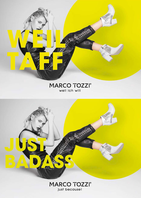
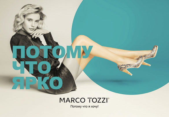
With their “Weil ich will” campaign for the women’s shoe brand Marc Tozzi, Wynken Blynken & Nod Advertising Agency (formerly Supermoon) set out to make a brazen appeal to the typical fashion enthusiast’s inner sense of volition. The tagline, which basically means “Because I want (to/it)” was conceived as the extension of an interchangeable headline that needed to be streamlined, where possible, to a minimum of one word matched with the conjunction ‘weil’ (‘because’). The initial headline packed just the punch necessary to kickstart the campaign with the challenge of reproducing it inherited by the creative department at the agency and by extension our transcreation team. The combination of the headline “Weil geil” with the refrain-like tagline “Weil ich will” could be understood to mean “because it’s hot” (that is, sexy, wicked, awesome) and thus, “because I want (to/it)”. To complement the statement, a sassy model was depicted sporting the various Marc Tozzi products in aesthetic interaction with the chosen typography. In collaboration with the creative agency, we went to work not just to transcreate an idea but to defiantly trans-cop an attitude, one that would be able not just to go out there and ‘give ‘em some lip’, but if necessary to sulk like a teenager as well. The target here, of course, was not necessarily the age group depicted but rather the inner adolescent of a wide spectrum of years, the potential customer for whom the whimsical act of shopping is no less than a gratifying expression of arbitrary will. As a mere alibi for a justification, the cavalier explanation “Weil ich will” flippantly asks between the lines, “dare you question?” The relatively direct Russian rendering worked well, both communicating just the defiant posture we desired as well as providing a template that could be adapted to any series of headlines. Although its length made it typographically less pliable than the original – a common problem with Russian adaptations – the design could be compromised in order to retain the necessary attitude. In contrast, the English language lent itself well to the solid architectonic reduction of a sassy juvenile backlash to Mom and Dad’s equally imperious alibi for a proper answer: “Just because.” After brainstorming both with and without the creative agency, we were able to produce a tagline so succinct that it carried equally as much impact as did the original. The product was a textbook case of the rewarding communication between client, creative agency and transcreation agency.
Obviously, the earlier the transcreation team is integrated into the creative process, the more efficient and effective the transnational campaign will be. In the course of 17 years, we’ve seen no significant change in the personal level that this traditional exchange of ideas takes place on, despite the dogged attempts of content management systems to colonize workflow in a charitable effort to relieve the communication industry of the burden of dialogue. A curious change we have admittedly experienced has been a steady increase of a kind of marketplace dyslexia that seems to understand our repeated insistence on Mies van der Rohe’s dictum, “less is more” as meaning “more for less”, a phenomenon by no means unique to our industry – one to be attributed at least in part to the permeating atmosphere of automation, if not its direct influence. Whereas Adapt offers a diverse variety of other services such as translation, design and ‘real world’ typography, ones that are perpetually just two steps ahead of automation technology, the fields of copywriting and transcreation still appear to have a reliably firm lead on the grey spectre of artificial intelligence. We’d like to assume that these professions will first go the way of John Henry and Captain Ludd the day some philanthropist discovers a cure for advertising, if not for language itself.